
| Sun | Mon | Tue | Wed | Thu | Fri | Sat |
|---|---|---|---|---|---|---|
| 1 | 2 | 3 | 4 | 5 | ||
| 6 | 7 | 8 | 9 | 10 | 11 | 12 |
| 13 | 14 | 15 | 16 | 17 | 18 | 19 |
| 20 | 21 | 22 | 23 | 24 | 25 | 26 |
| 27 | 28 | 29 | 30 | 31 |
CATEGORIES
RECENT ENTRIES
BLOG ROLL
Paintings of a different color
William Bailey and Giorgio Morandi both painted still lifes of vases and other common household items. Mark Rothko and Josef Albers both painted square or rectangular blocks of solid color. But overlapping subject matter does not equal overlapping content, argued poet Mark Strand, the Andrew MacLeish distinguished service professor in the Committee on Social Thought, Tuesday afternoon in Foster Hall.
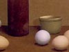
Showing slides first of Bailey’s and Morandi’s work, then of Rothko’s and Albers’s, Strand attempted to demonstrate that sometimes “differences outweigh the similarities” between “ostensibly similar” works. A Bailey still life resembles “a royal family portrait,” static and conclusive, while a comparable Morandi painting produces what Strand called “the odd feeling that the objects are together and holding still for a pleasing instant.”
If the difference between the still-life painters manifests itself in the viewer’s reaction, the contrast between Rothko and Albers lies in how they approached their art. Rothko called one painting Orange and Yellow but insisted color wasn’t important, urging viewers to “disregard color.” (“If Orange and Yellow is not about orange and yellow, what is it about?” Strand asked.) Albers, on the other hand, freely experimented with and appreciated color. And unlike Rothko, “there was no admission on Albers’s part that he ever wept when he painted.”
During the question and answer period Strand was accused of favoring Morandi over the other artists he discussed. But, he assured, “I like them all equally.”
By Phoebe Maltz, ’05
 |
 |
 |
 |
Photos:
From left: Giorgio Morandi, Still Life (The Blue Vase), 1920. William Bailey, Table with Ochre Wall, 1972. Mark Rothko, Orange and Yellow, 1956. Josef Albers, Homage to the Square: With Rays, 1959.
March 2, 2005