Seal of approval

Vincent Yu, '14, designs a new look for the University of Chicago’s old logo, just for kicks.

revised-phoenix.jpg
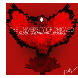
Vincent Yu, ‘14, hasn’t even started classes yet, but why would that prevent the incoming first-year from getting a head start on the kind of critical thinking he’s excited to partake in at the U of C? A self-taught graphic designer, Yu decided at the beginning of August to update the look of the University seal for a more modern audience, posting his slick new design on his blog, idionsyncratic reminiscences. The San Jose native took a minute for a phone interview with UChiBLOGo to discuss the what brought the beaming bird about.


QandA_QDrop.jpgWhat made you want to come to the University of Chicago?
QandA_ADrop.jpgThe overwhelming intellectualism of the University, and also the art and culture of the city—an authentic, original American city.
QandA_QDrop.jpgWhat made you want to redesign the University seal?
QandA_ADrop.jpgI wanted UChicago apparel, but when I was looking through sweatshirts I didn’t like what I saw. Most people would get the normal logo and get it on a custom sweater…. It’s a pretty awesome logo in itself—it’s a pretty complex logo for a University seal—but as I was looking at it, it was more complex and, not retro, more classic than would probably be necessary for a sweatshirt in the contemporary world of design…. I wanted to design a seal that didn’t have as Byzantine a look, as complex a look as the original logo has.
QandA_QDrop.jpgWhat were you going for?
QandA_ADrop.jpgI guess you can say it was a hybrid of the Twitter logo and what I thought was UChicago, the original seal. I wanted something that was sort of a phoenix and had the remnants of the original logo, but was as accessible as the Twitter logo.
QandA_QDrop.jpgSo what’s going on in the new seal?
QandA_ADrop.jpgIt does have sort of the feather designs. You can see the patterns going on in the bird’s wing, but the shape looks a lot more symmetrical than the original logo was, in terms of the bird’s wings.
QandA_QDrop.jpgIts eyes look kind of vacant. Why’s that?
QandA_ADrop.jpg[The Twitter logo] is just a white oval, so I guess it was just pirated from that. I guess the biggest reason was I wanted it to be contrasted from the original Chicago seal—you can tell it was hand-ink done, or stencil done. I was using the computer, which makes it much more difficult to create intricate designs…. [The design] also makes it more accessible, in terms of making it a modern, cartoonish image.
QandA_QDrop.jpgAnd it looks like the font’s been updated too.
QandA_ADrop.jpgThe font is just Avant Garde; I guess the style is condensed too. The business school loves to use Helvetica condensed…. I wanted to adapt that, but I didn’t want to be as bold as the Chicago Booth type face…it’s great for a school like Booth—it’s a brand name that’s recognizable—but here I wanted the focus to be on the image.
QandA_QDrop.jpgHow’d you get to be so artistic?
QandA_ADrop.jpgMy parents originally tried to enroll me in art classes when I was in second grade, like, paint-the-vase kind of classes…the traditional approach to art. I really didn’t like it, I really didn’t like the idea of art for the majority of my life, from like 4 to 14. And then entering high school, I was very interested in journalism but I didn’t want to do newspapers…there was no permanence in terms of writing; what I wrote wouldn’t really matter in the next month or the next week.
QandA_QDrop.jpgWhy did journalism appeal to you?
QandA_ADrop.jpgI wanted to do something more concrete, and I know yearbook doesn’t sound like journalism, but I made it my goal to make it more journalistic…I got to doing that. Obviously I didn’t lose my love towards journalism, I still love to report on the interesting stuff…. I sort of just transitioned from layout to actual illustrations, and I guess that’s how I sort of got into it.

Asher Klein, '11

August 30, 2010