| Sun | Mon | Tue | Wed | Thu | Fri | Sat |
|---|---|---|---|---|---|---|
| 1 | 2 | 3 | 4 | 5 | ||
| 6 | 7 | 8 | 9 | 10 | 11 | 12 |
| 13 | 14 | 15 | 16 | 17 | 18 | 19 |
| 20 | 21 | 22 | 23 | 24 | 25 | 26 |
| 27 | 28 | 29 | 30 | 31 |
CATEGORIES
RECENT ENTRIES
BLOG ROLL
Glass and steel, revisited
Seattle's glittering Central Library prompts comparisons to UChicago's own crystal book-palace-in-the-making.

On vacation in the Pacific Northwest last month, it was exhilarating to get out of Chicago and take a couple weeks of much-needed R&R. After all, a reporter can get pretty worn out covering the fast-paced world of rare books, precious manuscripts, andautomated storage-and-retrieval systems.
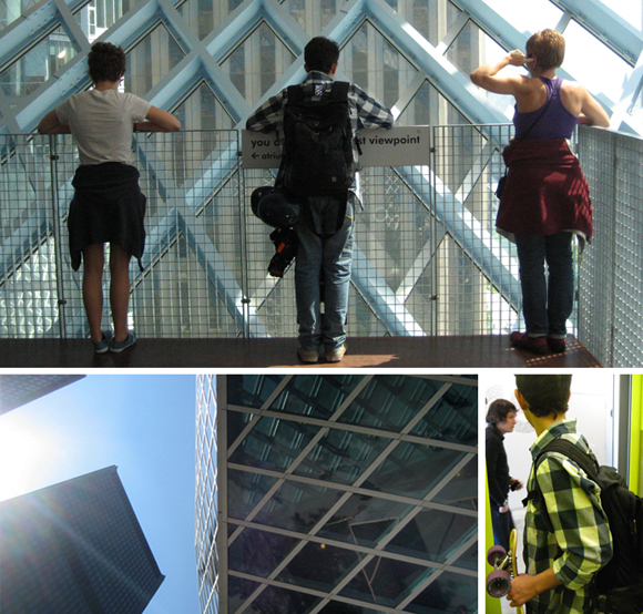
Call it a buswoman’s holiday, but just after landing in Seattle I couldn’t resist dragging my family to see the sparkling downtown Central Library. It was worth the visit. The minute we entered, we felt the thrum and hum of activity. We oohed and aahed at the views of the city and Elliott Bay through the building’s soaring glass-and-steel façade. My teenage nephew brought his longboard into the slick chartreuse elevator, which was packed with patrons who had come to use the public computers, collections arranged in a winding, six-floor “book spiral,” and vast, visually quirky reading rooms.
Designed by Rem Koolhaas and Joshua Ramus, the Central Library has attracted both kudos and criticism. This month, a panel of architects placed it near the top of Vanity Fair’s list of modern marvels and when the library opened in 2004, critic Herbert Muschamp extolled it as “the most exciting new building it has been my honor to review.” But six years into its young—and busy—life, the library has drawn fire for its functional shortcomings. Bottom line: the glittering glass box is a fabulous, flashy jewel in Seattle’s architectural crown, but maybe not such a great place to find and read a book.
Returning to my job at UChicago, I felt a bit of déjà-vu when I learned that the glass panels were being installed at our own Joe and Rika Mansueto Library. What’s more, the German company Seele—which created the Seattle Central Library’s dazzling grid and many other steel-and-glass constructions around the world—is also doing the work on our own crystal book palace.
It was tempting to compare the Mansueto Library’s sweeping elliptical dome, designed by starchitect Helmut Jahn, with the Seattle library’s radiant glass skin. From there, I easily jumped to worrying that in our own new building, form could trump function. But maybe not: the Mansueto is modest in comparison to the 11-story urban wonder in Seattle, and the dome is just a spectacular cap to what is mainly a gargantuan underground book-storage facility.
What’s more, UChicago has a long tradition of collections-based scholarship, and planning for the new library has benefited from the intensive involvement of researchers, librarians, archivists, and conservators. There’s every reason to hope that it won’t only be a cool building, but also a beating heart for research, a wonderful place to read, and a glimmering bridge between the past and future. In spring 2011 we can test that hypothesis.
Elizabeth Station
September 2, 2010
