Paper Campus

The paper campus

apf2-00164University buildings that never were.

I'm fascinated with things that never were, particularly when it comes to architecture. And particularly architecture from places I'm familiar with—it's fun to play "what if." So when I realized that the University of Chicago Library's Archival Photographic Files had a veritable treasure trove of drawings and models of campus buildings that, for one reason or another, were never constructed, I decided to start an occasional series. In each post I'll delve into the archives to examine some of these buildings that never made it off the drawing board.

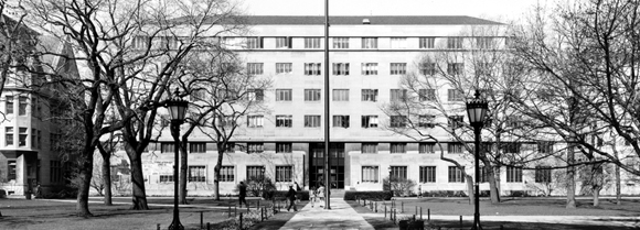
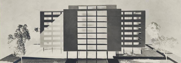
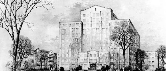
First up is the Administration Building. Plans for a dedicated building for the University administration appear to have existed for a while before the Admin Building that we all know and, uh, ignore went up in 1948.

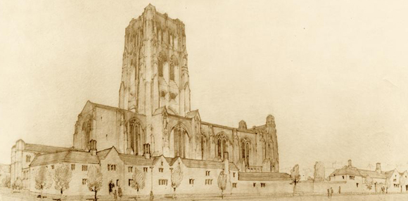
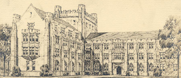
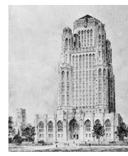
One early proposal (right) was this high-rise Gothic tower, a distant cousin to Tribune Tower or the University of Pittsburgh's Cathedral of Learning!

Judging by the buildings in the background, I'm guessing this would have been roughly where Goodspeed Hall is now. If so, this design might well predate the first classes at the University: Goodspeed was completed in 1892.

	apf2-00163

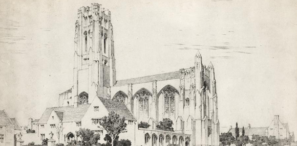
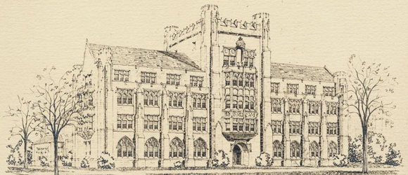
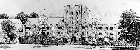
Sticking with the Gothic theme, this proposal (above) would have blended in nicely with the main quads. It isn't obvious from the rendering where this building would have gone, or even from exactly when it dates.

apf2-00166

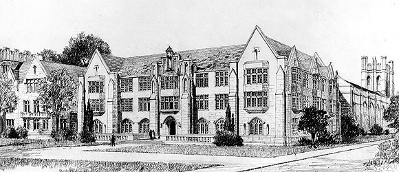
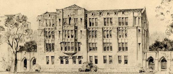
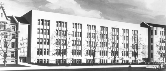
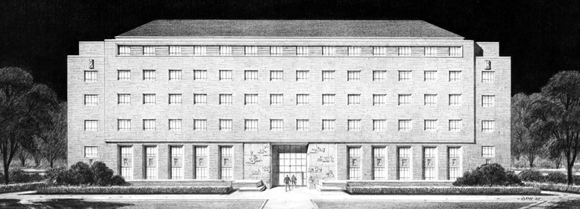
Architectural firm Holabird, Root, & Burgee proposed this design (above) after the Second World War, very close to what was actually built. It's notable for being perhaps the first infusion of modernism into the neo-Gothic main quads.

apf2-00280

But this rendering isn't quite as built: note the differences with the final version (above).

apf2-02693

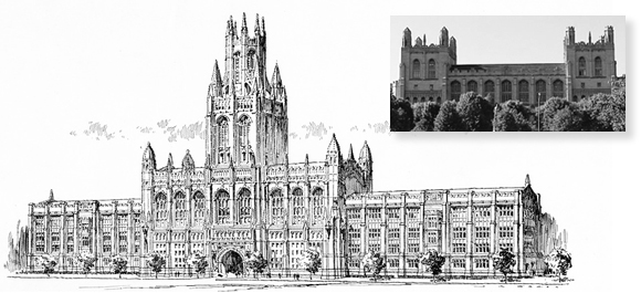
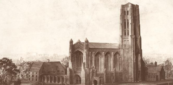
Setting aside Admin, let's go to an old campus favorite—Harper Memorial Library. If you ignore the enormous central tower, this design (below left, top) bears some resemblance to the final product. Note that even at this stage, the third-floor reading room is in place.

I'm not sure why the architect or University settled on the now-iconic twin towers instead of a single spire, but I can't imagine Harper without them.

apf2-03084

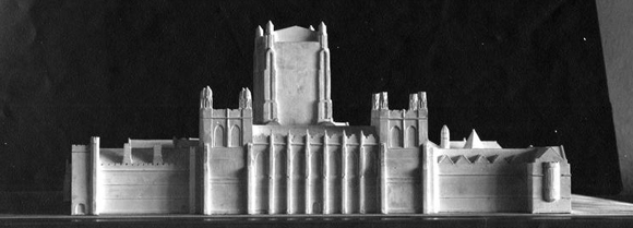
In the 1930s there was a proposal to give Harper more space for books by adding another tower for book stacks onto the side of the building. I'm not sure why this idea fell through, but again, I'm glad. There isn't much detail on this model, but one can only hope those upper stories wouldn't really have been windowless.

Do you have further insight into the history of either of these buildings? Leave a message in the comments.

Benjamin Recchie, AB’03

Photos courtesy of the Archival Photographic Files, Special Collections Research Center, University of Chicago Library

The paper campus: Alternate Rockefellers

Part two of our series on the unbuilt campus.

As part of my occasional series on proposals for University buildings that never came to fruition, I’ve dug up a few early proposals for one of campus’s most iconic buildings: Rockefeller Memorial Chapel.

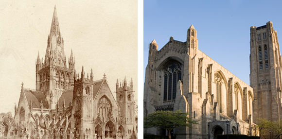
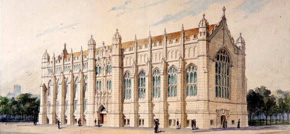
Henry Ives Cobb designed the first buildings on the quadrangles and came up with the initial campus master plan. In this barely legible map from the University’s earliest days, there’s space reserved for a chapel at the intersection of 58th and University. Here’s an early Cobb design for a chapel (left) next to the completed Rockefeller Chapel:

apf2-06575r

The first thing to note about this design is that, while still Gothic, it’s a departure form the English academic Gothic that inspired the design of most of the other buildings on the quads. With its flying buttresses and ornate decoration, it’s much more like the French Rayonnant style.

Here’s another proposal from the early ‘20s by Bertram Grosvenor Goodhue, much more in the English Gothic mode:

apf2-06558r

At first glance, this appears to be much closer to the final design. Notice that this design, like the one by Cobb, features a crossing tower above the intersection of the transept and nave. By this time, the chapel’s location had been definitively moved to 59th Street. Note the surrounding buildings, proposed quarters for the Oriental Institute.

The University balked at the expense of Goodhue’s design. As a cost-saving measure, the architect proposed moving the tower to the side:

apf2-06567

But wait—the tower is on the west side, not the east. After Goodhue’s untimely death, and some wavering on the part of the University, the final design moved the tower to the eastern side and includes a covered walkway connecting it with buildings to be constructed on University Avenue:

apf2-06560

The walkway was never built. Only a small part of the secondary buildings were—today’s Oriental Institute.

Do you know anything more about how these designs were fleshed out? Let us know in the comments below. You might also be interested in part one of the Paper Campus series, on the Admin building and Harper Library.

Benjamin Recchie, AB’03

Photos courtesy of the Archival Photographic Files, Special Collections Research Center, University of Chicago Library

The paper campus: Quads from an alternate universe

Part three of our occasional series on the unbuilt buildings of campus

Welcome to another edition of the Paper Campus, in which I scour the University of Chicago Library photo archives for information on campus-building designs that, for one reason or another, remained on the drawing board. For this week are alternate designs for three of the science buildings on the main quads: Jones Laboratory, Searle Chemistry Laboratory, and Eckhart Hall. (Not to be confused with the William Eckhardt Research Center.)

First up: Eckhart. The little fenced yards on this design remind me more of an English country estate than an academic building.

apf2-02105

Now to Jones Lab. An early design had a handsome crenelated tower at the corner. Here's a view from the quads.

apf2-04545

And, here's a view of the same design from Ellis:

apf2-04547

And, here's the building as constructed in 1929:

apf2-04546

Note that the architects planned arcades connecting Jones to future construction on either side. As it happened, the area for the south arcade was left as open space, and Searle Labs was built abutting Jones, leaving no room for one on the north.

And speaking of Searle, here's an early take on that more modern building.

apf2-07297

I actually like this one better than the building as built. It has more natural light, and I dig the textile blocks over the entrances. But like Hawk Harrelson says, "Right size, wrong shape."

Benjamin Recchie, AB’03

Photos courtesy of the Archival Photographic Files, Special Collections Research Center, University of Chicago Library

Let a thousand Regensteins bloom

Part four in our series on the campus that never was.

Welcome to another installment of the Paper Campus, in which I dig through the U of C Library's archives to find alternative and rejected designs for campus buildings. Today, I've got a doozy for you--one of my favorite spots on campus, the Joseph Regenstein Library. (For the record, I freely admit that my fondness for the Reg comes mostly from its contents, not its severe, brutalist architecture.)

Many of the early proposals for the library assumed a location at the open end of the quads, at 58th and University. (Faithful Paper Campus readers will remember that site as the original proposed location for what became Rockefeller Chapel as well.) It's also interesting to note that the chosen site wasn't right up against University Avenue (in the way that the Admin Building fronts Ellis Avenue), but appears to be closer to the center of the quads. Hmmm.

Let's start with this ultramodern design:

apf2-06105

Look, I like modernism as much as the next guy—actually, probably more than the next guy—but this is just awful. There's no way this ever would have looked right. I can't even be certain that it would have had windows.

To cleanse our palate, have a look at these old-school Gothic proposals. Judging by the similarities in the renderings, I suspect they were done by the same architectural firm:

apf2-06106

apf2-06107

These buildings would have fit in seamlessly with the older structures on the quads. But collegiate Gothic was out of fashion in the '50s and '60s, so a Gothic Reg never had a chance.

Now here's an extremely boring design:

apf2-06109

I'm falling asleep just looking at it.

This proposal tries to blend a little Gothic with some modern sensibility:

apf2-06108

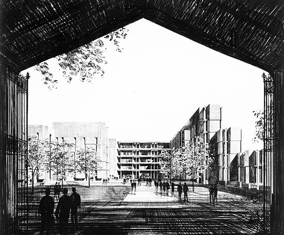
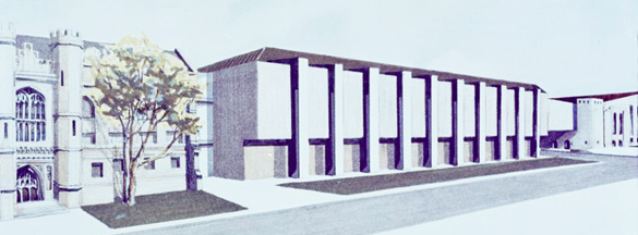
Now here's a proposal from Walter Netsch. Look familiar-ish?

apf2-06112

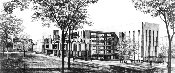
This is obviously the design the University selected to proceed with, although at some point they decided to move the library to the site of old Stagg Field. Whether this was prompted by concerns about the layout of the quads or simply the realization that they could build a bigger building on 57th Street is unclear.

Here's Netsch's brutalist design moved to north of the quads:

apf2-06110

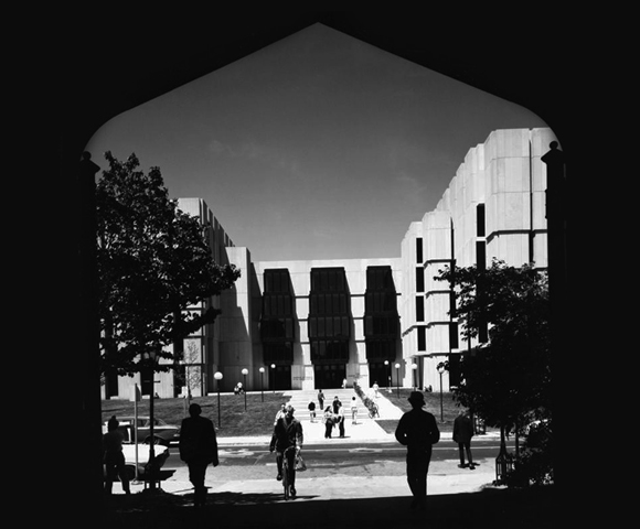
Change the central windows and some of the massing on the east side, and it's pretty darned close to the Reg as built. Compare this rendering with this photo taken from the same vantage point:

apf2-06167

Does anyone know anything else about these rejected designs or the Reg's genesis? Feel free to share in the comments.

Benjamin Recchie, AB’03
Images courtesy of the Archival Photographic Files, Special Collections Research Center, University of Chicago Library.

Swimming in an imaginary pool

Part five of our ongoing series on campus buildings that never were.

Welcome to yet another edition of the Paper Campus, in which I mine the University of Chicago Library's photo archives for glimpses of the way campus could have turned out, but didn't. Today, I'm presenting a slew of never-built athletic buildings.

First up is Bartlett Gymnasium. Yes, children, once upon a time, Bartlett was a gym (with a pool in the basement, no less). Here's an early concept for the building:

apf2-00549

It's about the same size and shape as the final design, but the details are quite different. I suspect the University rejected this design in favor of the one we know today to provide a larger floor space for the gym proper. (Note that the windows are different heights on different sides of the building; I'm guessing the right side was the basketball court, and the left side had smaller athletic facilities.)

Around the time the design for Bartlett had been finalized, there came about this proposal for dual gyms. If you look closely, you'll see that the left building is the "real" Bartlett:

apf2-00548

Why two buildings? My guess is men's and women's gymnasia. Recall that Ida Noyes Hall was built in part to provide women with their own gym, pool, and athletic field. Needless to say, neither that second gym nor the flanking buildings were ever built.

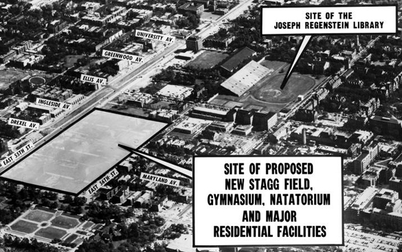
Speaking of pools, at some point the University realized that "We've got a pool in the basement of our turn-of-the-century gym!" didn't look as good in a prospective student brochure as it once did. As we can see from the picture below, building a natatorium was considered a high priority in the 1960s, before Stagg Field was demolished to make way for the Reg:

apf2-07830

The area next to the new Stagg Field is precisely where a new gym and natatorium would eventually go, except that it took four decades to finally build them. No student housing ever turned up there, either, unless the desk clerks at Ratner are sleeping in the locker rooms.

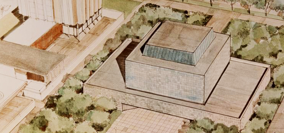
Here's an undated (but probably 1970s or '80s) concept for a new natatorium, which cleverly connects Bartlett with the Henry Crown Field House:

apf2-05325

Judging by its lack of windows, I wonder if architects intended it to double as a bomb shelter, or perhaps store spent nuclear fuel. God forbid people in the pool look out at the buildings across University Avenue.

The University must have liked the concept of connected athletics buildings. Here's another take on a natatorium for the same site:

apf2-05327

I like this design much better, especially the skylights above what I presume is the pool.

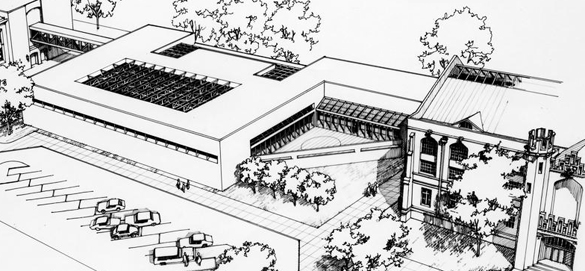
For those who prefer their buildings forbidding and windowless at ground level, there's this proposal, sited in the field between Henry Crown and Pierce Hall:

apf2-05321

Between the mausoleum-like architecture and the missed opportunity to connect the older gyms together, I'd say this proposal is a waste of a perfectly good open field.

Do you know anything else about these rejected designs? Tell us in the comments.

Benjamin Recchie, AB’03
Images courtesy of the Archival Photographic Files, Special Collections Research Center, University of Chicago Library.

Pierce II (and other phantom buildings)

Part six of our Paper Campus series.

By Benjamin Recchie, AB'03
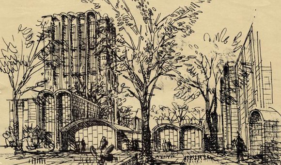

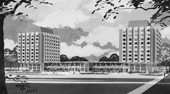
Welcome to another installment of the Paper Campus, in which I dig into the University of Chicago Library's archives for designs of buildings that were rejected, modified, or otherwise never were. This week, let's look at the unbuilt buildings of the north side of campus, starting with this gem:

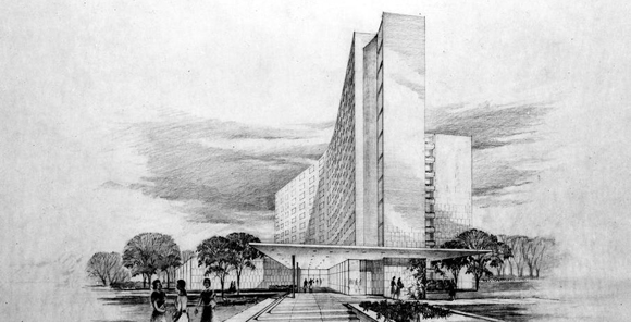
apf2-05777r

Yes, it's Pierce Hall's long-lost twin. Pierce II, as it was semi-officially known, may be the most obvious unbuilt structure on campus, since its absence is so conspicuous: the exterior of Pierce's dining hall terminates in a blank brick wall abutting a parking lot where the second tower should have gone. The plan for a second building also explains why the entrance to Pierce is sited halfway into the block—it would have served as a central entrance to both towers, as this view, looking north to 55th Street from University Avenue, shows.

(As an aside, Pierce was built as a men's dormitory, at almost the same time the University was building an all-female dorm in the form of Woodward Court. But that topic deserves an entire blog post to itself.)

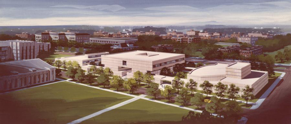
Why was Pierce II never built? A 1960 feature on the new dormitory in the University of Chicago Magazine stated it was the University's intention to eventually build a second tower at the time. In fact, we can glean a few clues about Pierce II from a completely different proposal by the architect Edward Barnes, in 1967, for a new set of quadrangles north of 56th Street:

apf2-05333r

In this view, 56th Street is in the foreground, and a pedestrianized Ellis Avenue runs through the center. A 1967 Magazine article describes three components to the proposed North Quadrangles: a Student Village, with 800 beds and commensurate study and dining space; a Center for the Arts, consisting of a theater, music building, arts center, and the then-new Smart Museum; and a new athletic facility, complete with a gym, athletic fields, tennis courts, and a natatorium. (The latter part isn't quite visible in this picture, so you'll just have to take my word for it that the athletic fields are at the left of this model.)

Now, here's how this relates to Pierce. This model clearly shows the Pierce II tower at the far right. (You can tell it's the unbuilt tower because the dining hall is barely visible to the right.) It's safe to assume then that it was still the University's intention to build Pierce II in addition to the North Quadrangles dorms as late as 1967. (The same Magazine article I referred to above mentions that there was a pressing need for dormitory space at the time, since urban renewal had eliminated much of Hyde Park's stock of student tenements affordable housing.) But the University gradually became less enthralled with the idea of a second tower: in 1970, a memo from University President Edward Levi stated bluntly "Architects admire Pierce Tower, but students don't."

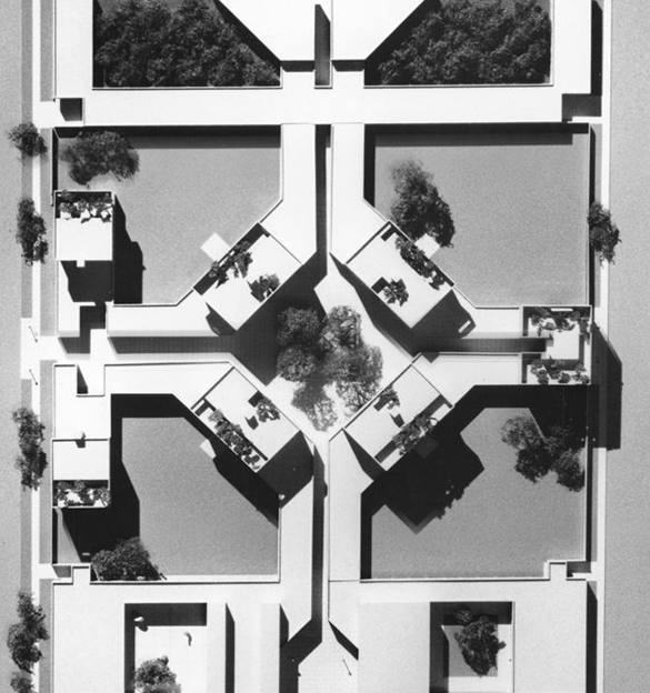
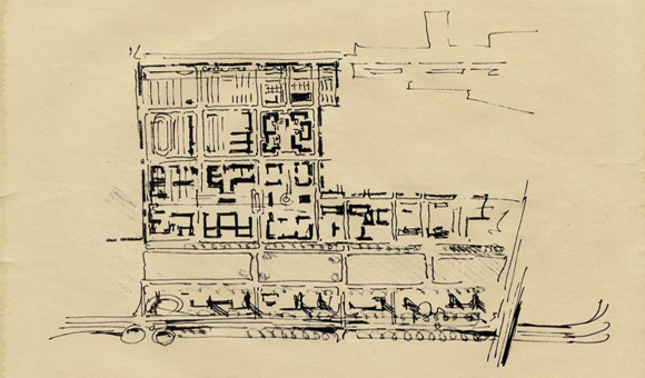
apf2-05332r

Note in this overhead view the four central buildings cocked at 45 degree angles to the rest of our otherwise rectilinear campus. Also note the rooftop gardens—a very cool idea that was unfortunately never implemented and perhaps ahead of its time.

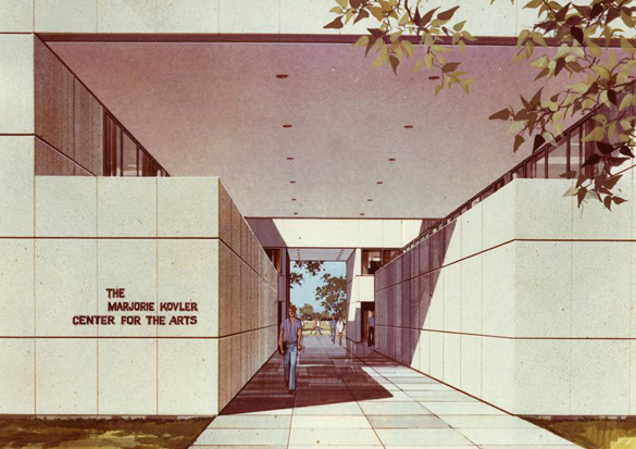
Nothing quite like this plan was ever built, which is a bit of a shame. The new gym and swimming pool were put off for more than three decades, although the relatively inexpensive athletic fields were built as promised. By 1970, spiraling cost estimates for the North Quadrangles prompted the University to send Barnes back to the drawing board for a more modest proposal for an arts complex:

apf2-01837r

Parts of this 1972 rendering of the Center for the Arts look familiar. There's the Smart Museum to the left, and the Cochrane-Woods Art Center is recognizable as part of the large central building. But the upper floors were never built, and the theater is much larger than the facility eventually built for the Court Theatre.

apf2-01838r

Here's a closer view of the complex, which the University had, in hope of a gift from Everett Kovler, named Marjorie Kovler Center for the Arts. (The name Kovler should sound familiar, since the family has given generously to the U of C; you might have heard of the Kovler Diabetes Center, the Marjorie B. Kovler Viral Oncology Laboratories, the Kovler Gymnasium at the Laboratory Schools, or the Everett Kovler Café in Chicago Booth’s Harper Center.) The construction of the Center for the Arts was divided into two phases. The first phase was CWAC and the Smart Museum; the second phase would have included a theater (again, in anticipation of a major gift from Albert Pick, called the Corinne Pick Theater), as well as an art library and music rehearsal spaces cantilevered over Cochrane-Woods.

The planned gifts from Kovler and Pick never came through; this, coupled with the tightening of the University budget in the early '70s and the inflation of the era meant that the University never completed phase II of the project. Only next year will some of the Center for the Arts' goals be realized, with the construction of the Reva and David Logan Center for the Arts.

Finally, what about the new dormitory space promised in 1960 and 1967? Nothing ever came of it. The U of C wouldn't commission a newly built dormitory until 2001.

Images courtesy of the Archival Photographic Files, Special Collections Research Center, University of Chicago Library.

The Woodwards that weren’t

Part seven of our Paper Campus series.

By Benjamin Recchie, AB'03
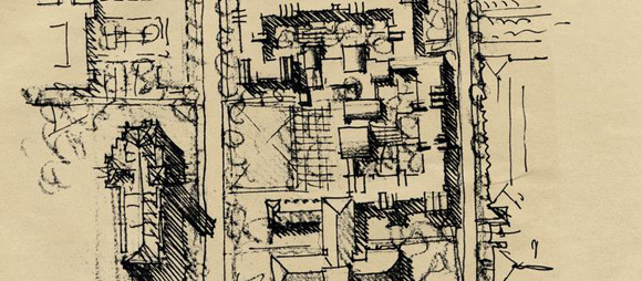

Welcome to another installment of the Paper Campus, in which yours truly scours the University of Chicago Library for hints of the road not taken with respect to the University's buildings. Today, we have a rarity for the series—a building that has already been demolished: Woodward Court. Woodward was designed as a women's dormitory and dining hall (just as Pierce Hall was originally a men's dormitory), although Woodward had long since turned coed by its demolition in 2002.

Let's start with this Holabird, Root, & Burgee pitch for the dormitory:

papercampus_apf2-08556r.jpg

There's no indication here of what site this building was intended for. It's a moot point, because the commission eventually went to Finnish architect Eero Saarinen, one of the giants of architecture in the '50s and '60s, and probably one of the two or three biggest names ever to design a UChicago building. Even if the name Saarinen doesn't ring a bell, perhaps you're familiar with some of his other buildings, such as this airport, this other airport, and this obscure monument in Missouri.

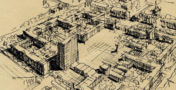
Saarinen was held in enough esteem that he was engaged to design an entire campus master plan:

apf2-08553r

His proposed dormitory complex was centered on the site of Stagg Field, visible to the north of the quads here. Other proposed buildings of note: a new building on the east side of the quads (maybe a library?), an addition to the Oriental Institute on 58th Street, athletic fields between 57th and 56th (a block south of where they would eventually go), and some kind of building on the field behind Ida Noyes Hall.

Also note the cloverleaf interchange at 61st and Cottage Grove: at the dawn of the interstate highway age, there was some thought to connecting the southern end of Lake Shore Drive and the as-yet unnamed Dan Ryan Expressway with a below-grade superhighway running through Jackson Park and Woodlawn between 61st and 62nd Streets. (One must wonder if it wasn't also intended as a kind of moat insulating University property from the rapidly changing neighborhoods to the south.) This proposal will make a cameo appearance in a later Paper Campus installment, but it never became serious enough to warrant being assigned an interstate number.

The large complex Saarinen proposed on the site of Stagg Field would have required demolishing not just the underused stadium but also Bartlett Gymnasium:

papercampus_apf2-08538r.jpg

In this view looking south, 57th Street crosses from middle right to top left.

papercampus_apf2-08537r.jpg

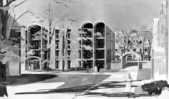
This is Saarinen's sketch of the ground-level view of the complex, including the tower building. Note the nods to Gothic architecture in the form of the arched entrances and window canopies.

Having decided that Saarinen's original proposal was too grand, the University asked for a smaller design next to Ida Noyes:

papercampus_apf2-08549r.jpg

This downscaled design would have had a physical connection with Ida Noyes, probably because that building was still the women's activity center on campus.

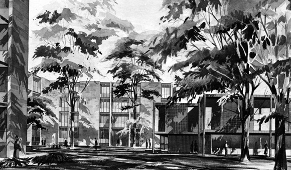
This rendering shows the new low-rise, towerless building:

papercampus_apf2-08555r.jpg

Note that the arched windows have been carried over from the Stagg Field proposal.

The design was then downsized yet again. Here, the dining hall is pushed up against 58th Street, flanked by dormitories:

papercampus_apf2-08558r.jpg

Sharp-eyed observers will notice that Saarinen has again projected an extension of the OI buildings across Woodlawn Avenue.

papercampus_apf2-08557r.jpg

As Saarinen refined the design, he eliminated the arches once and for all, erasing the last vestige of the original proposal.

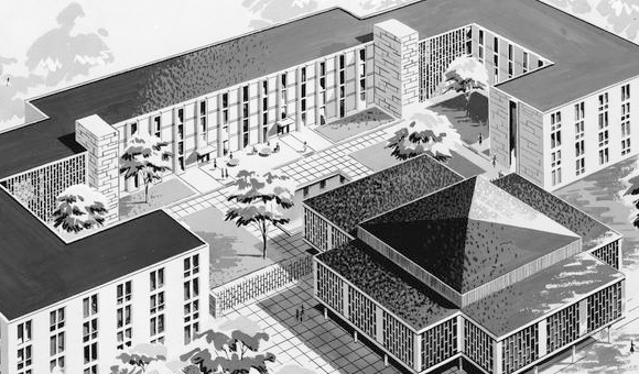
In this almost-final version of the building, the dining hall has been moved to the center of the courtyard:

papercampus_apf2-08519r.jpg

Compare this with the building as built in 1958:

papercampus_apf2-08518r.jpg

There are a few subtle differences: fewer windows on both buildings, and a flat roof instead of a peaked one for the dining hall.

Saarinen was reportedly unhappy with the way the University administration had value-engineered out so many of the building's architectural flourishes. (Rumor among Woodward residents held that he had asked that his name be taken off of the building—the architect's equivalent of an Alan Smithee—although I never saw any proof of that.) And it didn't stop Saarinen from designing the Laird Bell Law Quadrangle for the University, which opened the next year.

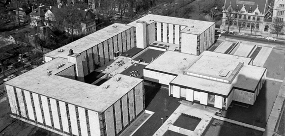
Woodward Court's modernist design didn't age well; few were sorry to see it replaced by Chicago Booth's Charles M. Harper Center, built on the same spot. Today, the only reminders of Woodward's existence are the Harper Center's echo of its mid-century modern exterior and the existence of Woodward House in Max Palevsky Central. (Coincidentally, just as Woodward Court was replaced by the Harper Center, the dormitory's Harper House was renamed Woodward House.)

P.S. Woodward Court deserves special note as the building whose prehistory first sent me to the archival photos, thus spawning the entire Paper Campus series. Thanks go to Jennifer Davis, AB'04, for first getting me interested in the subject.

Images courtesy of the Archival Photographic Files, Special Collections Research Center, University of Chicago Library.